LookFar Ventures12 November 2015
How to Make a Kick-Ass Pitch Deck Using Nothing but PowerPoint
*Slight post revisions made on 1/31/24*
…But We Won’t Build Decks
We love startups. We’d do almost anything to support a partner or potential partner. But just like Meatloaf, there is one thing we don’t do. We will not build your pitch deck.
Writing a pitch deck can be a time consuming and maddening process. But while we’ll do our best to provide help and templates along the way, there’s a reason we don’t include writing the entire deck as one of our services. We don’t include it because asking for a pitch deck is probably the single most important step of our vetting process.
If your idea cannot be organized into a compelling and well-structured pitch deck, then you are likely not yet ready for software development.
We’ll admit that it has happened to us many times when working on pitch decks for our own internal products. When you have to distill the business model or market size down into a few words things can suddenly seem a lot less compelling.
So we don’t do pitch decks for one simple reason: we don’t want to deprive you of the opportunity to think through every aspect of your idea.
It’s fairly easy to find resources on what type of information to include in your pitch deck. Here are three of my favorites:
- TechCrunch: Lessons From A Study of Perfect Pitch Decks
- The Ultimate Pitch Deck to Raise Money For Startups
- 30 Legendary Startup Pitch Decks And What You Can Learn From Them
These resources focus on telling you to think like an investor, and how to structure your deck so that it “tells a story.” But there are far fewer resources focusing on one of the most important elements of your pitch deck: design.
“But I’m not a designer!”
Admit it. You just thought that. Most people think of design as being related to beauty and symmetry. Not necessarily.
Design is a way of communicating.
So even if you’re not a designer, having a tight, branded pitch deck will communicate to investors:
- That you’ve put some time into your project.
- That you have someone on your team with enough marketing savvy to know that design matters.
- That you’ve already begun to think about your product as a brand.
You don’t need the Adobe Suite or a fancy design firm to make a beautiful pitch deck. All you really need to make a pitch deck as good or better as anybody: good ol’ PowerPoint. (Or Keynote. Or Canva.)
I’m going to talk through a few of the key ways you can up your pitch-deck game using only software that came pre-installed on your computer.
LOGO
Your startup or mobile app idea deserves a succinct, visual representation. At this stage, there’s no need to shell out money for a designer. I firmly believe in your ability to create something awesome in PowerPoint.
You’ll want to play with the available shapes, fonts, and colors. Try to create something memorable that visually relates to your business.
Here is a quick logo I whipped up in PowerPoint for my fake business.
![]()
Is this the best logo you’ve ever seen? Of course not! But it provides a brief, visual identity for my product. Now I have some shapes (arrow and parallelogram) and colors that I can use for the rest of my document! You can do it too!
Don’t forget that big corporations can and do change their logo as they grow.
TIP: To save your logo as a PNG, click on all the elements of the completed logo. Right click and select “Group.” Then right click the image again. It should all be highlighted as one asset. Select “Save as Picture.” You now have a portable PNG of your logo.
COLOR
90% of the pitch decks we get are black text on a white background. It’s a classic look, but consider using color to help guide the reader visually through your content. Take a look at the difference between these two slides:

vs.

Now take a look at what happens when I add additional contrast:

Use color for punch and consistency throughout your deck. Use a tool like RGB-finder to pull the hex-codes for the colors from your logo so you can share the exact color with everyone in your organization.
TIP: Need help coming up with a color palette for your startup? Use a free color scheme generator like Coolors. Try to find colors with a bit of grey or brown mixed in. Primary colors can be too bright and even visually fatiguing in large doses. Example:

FONT
90% of the pitch decks we get use Calibri as their primary font. This means that visually, most of our pitch decks blend together. If you want to stand out visually, I strongly suggest that you explore fonts other than Calibri.
Don’t be afraid to download and install new fonts. The League of Moveable Type offers plenty of free, open source fonts to play with.
Even if you use a pre-installed font that comes with PowerPoint you can customize it by selecting a condensed or light version and adjusting the character spacing. Check out the difference a simple font change makes on our slide:

vs.

The new font is thinner and sleeker, while still remaining highly readable.
TIP: Besides Calibri, there are a few other fonts we recommend staying away from. Times New Roman, Comic Sans, Papyrus, and any font that is hard to read. Try Roboto, Franklin Gothic, and Avenir for modern-looking fonts.
SPACING
Keep an eye on your spacing throughout the deck. When I tried out the Helvetica font, this happened:

Breaking up my key message weakens the slide significantly, and makes the overall design look sloppy. If this happens, you can simply adjust the size of the text box, or font size.
GRAPHICS
Before you spend time making a graphic, ask yourself – does this graphic help communicate this information better than plain text?
vs.
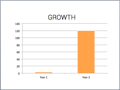
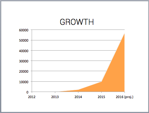
Graphs are best used when you want to communicate a lot of data.
vs.
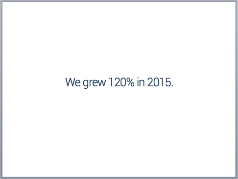
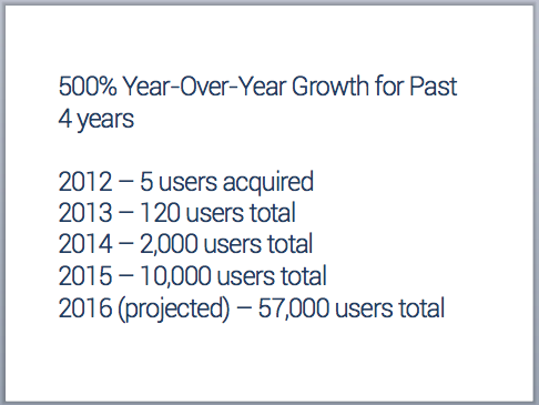
A good rule of thumb is if you have 3 or less data points or ideas to communicate, use text. If you have 4 or more, find a way to make it visual through a graph or infographic – PowerPoint has a pretty good built-in engine; try infogr.am if you’d like something a little more ambitious.
IMAGES
Using imagery in your pitch deck helps break up text. But images plopped on to the page usually end up looking…plopped on to the page. Use edge-to-edge images for a cleaner look.
vs.

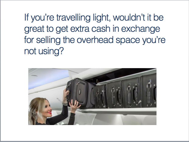
Don’t use stock imagery or use images just for the sake of using images. Add imagery when it helps you tell the story more succinctly. In the below slide, I substituted images of the over-packer and light-packer rather than identifying them with text.

Pixabay, Unsplash, and Flickr’s Creative Commons section are great places to find free photos that you can use for non-commercial purposes.
TEXT
With only 10-12 slides available, there can be a temptation to pack in as much information as possible onto each slide. Keep your slides simple and impactful.
If you need a lot of text to make your point, make your point stronger.
A few parting notes:
- Always save and send your pitch deck as a PDF. This will make sure that all your formatting, fonts, and imagery stays intact no matter who is viewing the deck.
- Don’t forget to put your contact information on your deck. If your pitch deck gets circulated among a team of possible investors, you’ll want to make sure they know how to reach you!
- Don’t stop working on your pitch deck. You may have multiple versions, each highlighting specific opportunities, tailored to specific audiences, or even laser-targeted at a specific judge you know you’ll be pitching to.
- When you’re ready to move on to the software development stage, contact us!
Like this post? Bookmark it on Pinterest:
Written by
 How to Build Your Magic Machine: A primer on technical development for Startup Founders
 Net Neutrality in the Southeast: Why Emerging Hubs Should Fight for Title II

Copyright © 2025 LookFar Labs. All rights reserved. Privacy Policy