LookFar Labs15 June 2017
A Founder’s Guide to Wireframes: Common Types and Tools
As a founder in the tech industry, you’re going to have to get comfortable with wireframes.
Knowing what wireframes are, why they’re so frequently used, and how to dive in and build your own can vastly improve the chances your website or product will be understood as intended.
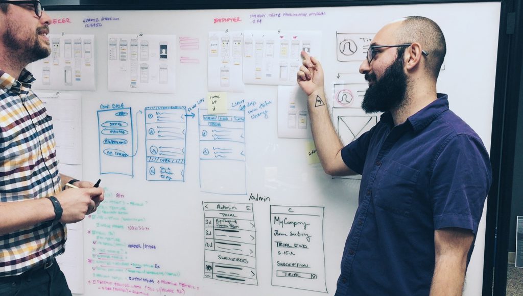
Wireframes, or mockups (we use both terms here, but mockups are best thought of as higher-fidelity, more design-intensive models), are essentially a diagram or framework that represent elements of an interface. In software development, wireframing is meant to provide a clear, concise understanding of an app screen, website prototype, or other software interface before any actual coding occurs. At best, they can help solidify product planning by tying ideas to a visual layout.
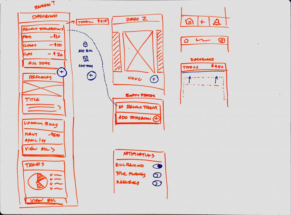
Whiteboard wireframes exploring user flow and interface elements.
One important point: wireframes shouldn’t be etched in stone. Their real value lies in how easy they are to adjust as new ideas or aspects of a product pop up. As you work to uncover an interface system that works for your product, it’s a near guarantee that you’ll see ways to improve it. When you do make a change; it’s much cheaper and faster to feel out some design choices at this stage than it is once the product’s actually developed.
Now, who creates wireframes? Often, that responsibility falls to a UI/UX designer or developer, but it’s extremely useful for product managers and product owners to visualize their thoughts and ideas as well. Get some basic techniques under your belt, and you’ll be much better equipped to visually communicate your ideas to teammates, users, and decision makers at other companies.
Low to High
Wireframing is extremely valuable before the design phase ever kicks off. It can save time by confirming expected user behavior is in-line with product hypotheses, uncover user experience issues that may not have presented themselves otherwise, and it’s much quicker to work through solutions on a whiteboard or in a notebook than designing and iterating in Photoshop or Sketch.
This is where the idea of different fidelities come in. As you may have noticed, there’s no such thing as a single sort of wireframe. It’s a big, catch-all term, and wireframes can run the gamut from pencil sketch to highly designed digital mock-up. Each of those extremes, and everything in between them, have their distinct place when prototyping a product. We’ll run through a few that you might encounter – with examples of each – starting with the most accessible and ending with the least.
Low Fidelity: Freehand Wireframing
Whiteboards & Sketchbooks
Sketched or whiteboard wireframes are considered “low fidelity” in that they are typically freehanded and can be easily erased and amended. Working with these simple options makes it much quicker to run through variations, prioritize content, and even brain-dump ideas and features to a team. They’re also low-cost; in the early days, your best free wireframe tool is almost certainly going to be a whiteboard. On the other hand, they’re not going to give users much beyond the very bare bones of your proposed workflow.
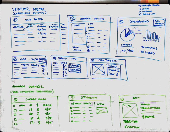
Dashboard interface wireframes with placeholder content.
Internally, whiteboards get used for all sorts of things: network architecture diagrams, user flows for an app, content for a website layout, endpoint listing, data modeling, persona development, information architecture, and so much more. As I write this, I don’t think there’s a single completely blank board in the LookFar offices.
The value of using a whiteboard in these sessions is that it allows you to iterate through as many solutions to a problem as possible. Whether you’re working on a representation of a user flow or a more detailed view on how a particular feature or interaction will work, whiteboards are an extremely productive way to define and exchange ideas on the fly.
A good measure of how brain-racking a whiteboarding session is- the number of colors you can spot on your “eraser-hand”
As a founder, a whiteboarding session is a great time to ask questions, request clarification if needed, and if comfortable, draw or write what you’re thinking. Prime opportunities for a white boarding session include:
- early stage design or discovery meetings to elaborate on key findings
- persona exploration by defining personality, pain points, and motivations a user may encounter
- feature requests allowing you to build a strong user experience
Every one of these elements can and should be drawn up so the team has a clear understanding of goals and functionality before moving onto design or development.
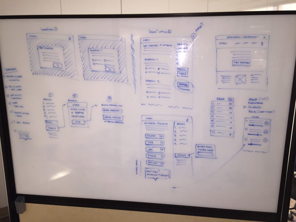
User flow, interface exploration, and content layout being considered.
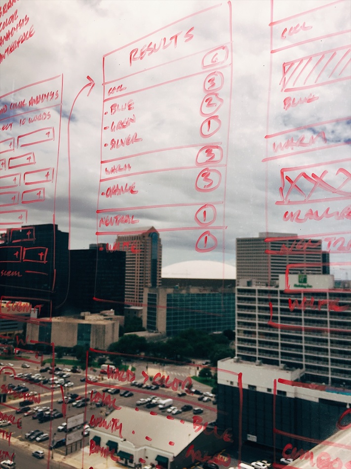
Pro Tip: When all the whiteboards are full, resort to window wireframing.
The caveat to wireframing in a notebook or on a whiteboard is that they’re less than optimal for presentation. They’re typically not proportionally accurate to an iPhone screen or web application, content may not yet be accounted for, line weights are inconsistent, and there’s no good way to group views to alter a particular flow.
Whiteboards can also be difficult to photograph due to reflection, but the OfficeLens app is a great solution that allows you to capture proper contrast and lighting on boards for later reference.
Despite their off-the-cuff nature, whiteboard mockups should continue to be referenced when moving into the design or development phase. Keeping these records of early brainstorming ensures that the original intent of a kickoff or feature request session is passed on to appropriate team members.
Medium Fidelity: Digital Wireframes
Balsamiq & Axure
It’s time for a higher fidelity wireframe when content, layout, and a clearer representation of an interface are needed to better visualize a feature or key step in your product. While there’s more work involved than rolling up your sleeves and seizing a whiteboard marker, it’s still very possible for non-designers to create these medium-fidelity images. Balsamiq, Axure, and similar tools use drag and drop interfaces rather than code and make creating accurately proportioned media for a web interface or app screen much more straightforward.
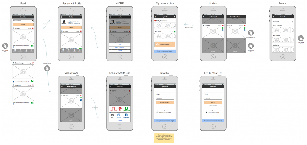
Balsamiq wireframes showing hierarchy of user actions and user interactions between views.
As a founder, it’s good to keep in mind that these “low to medium fidelity” wireframes are typically non-branded (and may even be presented in greyscale). Instead of focusing on branding, they’re meant to provide a more clear depiction of an interface with buttons, forms, and icons. Placeholder content can be mocked up, fonts can be explored, and it’s much easier to group and experiment with different layouts to create robust user flows to iron out user experience.
Defining interactions where a user may need a prompt or confirmation, knowing when to use primary or secondary buttons, how a form can be distilled down to increase usability, and their highly presentable nature are all aspects of what make these medium-fidelity mockups invaluable to founders.
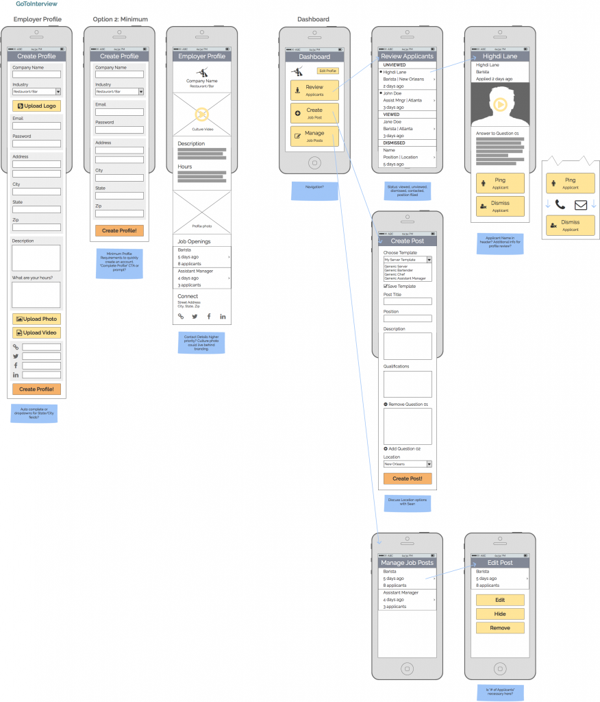
Long form elements and content mocked up in Balsamiq.
This stage of wireframing includes more precise interface elements from iOS, Android, and web interfaces and should include appropriate content and media placeholders. With proper training, they can even be put in front of users or investors to gauge interest.
High Fidelity: Designed Prototype
Photoshop, Illustrator, & Sketch
Once whiteboard sketches have been iterated upon and medium fidelity wireframes from Balsamiq have been pored over for accuracy, you may want to spring for a designed prototype (or higher fidelity wireframe). These screens can be branded, demo-ready, and interactive if appropriate.
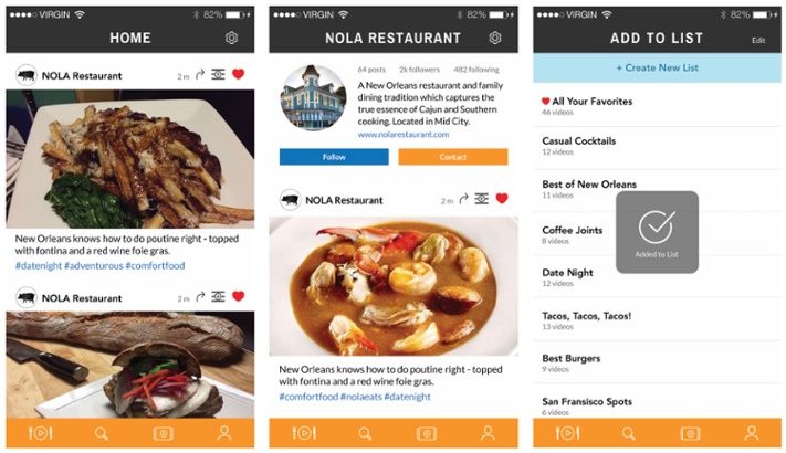
Branded mockup created in Photoshop with iconography, interactions, and menu treatment.
A UX/UI Designer may use a design program like Adobe Illustrator, Adobe Photoshop, or Sketch to create pixel-perfect, on-brand interfaces that can be put in front of users for feedback, presented to investors, and eventually shared with developers who will build functionality into your product.
Some cases may call for a prototype to be created without medium-fidelity wireframes being created, but it’s likely some form of wireframes will be created on a whiteboard or sketchbook beforehand; high-fidelity wireframes represent a pretty serious investment, as they generally require a designer’s attention, so most teams will want to work through pen and paper before jumping to Adobe.
Unlike medium-fidelity wireframing, high-fidelity wireframes give some life and details about the UI of a product. Color and branded components, custom iconography, a style guide to steer interface usage, button states, notifications and prompts, and other details a user may find valuable are all added at this stage.
When reviewing these flows, try to think like your defined persona or user would. Is it clear what can be interacted with or clicked on? What should the next screen or view look like (even before you see it)? Is there an effortless path in place for users to navigate key features of your product? Does the mockup represent your brand to users properly? By thinking like a user, you ensure that no bias influences your feedback and that people are confident and receptive when using your product.
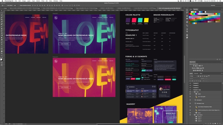
Styleguide of colors, typography, and form elements mocked up in Photoshop.
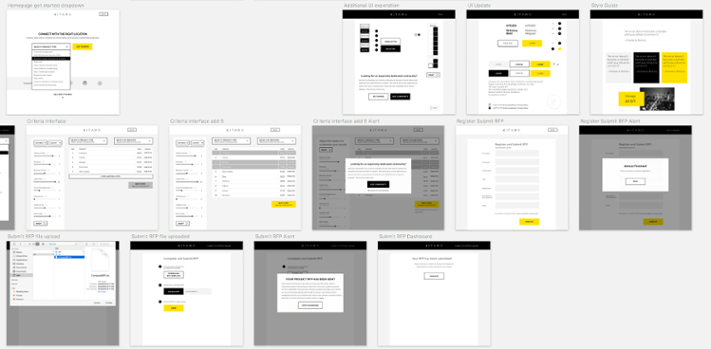
Mockups, styleguide, and branded interface elements created in Sketch.
Once a prototype is created, take this opportunity to put these designs in front of users to validate your assumptions on how they interact with the product. An interactive prototype can be created by importing designs into InVision by setting up clickable interactions that feel like like the real thing, but don’t require any data implementation or development.
Of course, it’s not like you need high fidelity prototypes to kick-off interactive testing. Even much simpler screens can still be enough for users to run through and check for clarity. Test early, test often; it’s way less expensive to fail and correct early on.
Wrap Up
It doesn’t stop there – wireframing can get as complex as you want it to. As a founder though, you’re most likely to see representatives of the above categories, and hopefully make a few yourself. One of the biggest takeaways that I’d like to leave you with is that you don’t need to be a designer to start prototyping. Mockups of any type are simply meant to be a visual means of communicating, testing, and refining your ideas.
My advice? Get out your pencil, pull out a whiteboard, and try to make a habit of using them as frequently as possible.
Written by
 Signal-Based Selling FTW with Creative Service Agencies
  Build vs. Buy: Third Party or Custom-Developed Software
