LookFar Labs2 February 2017
How to Design a Great App Icon: Optimizing for Visibility and Impact
Limited Pixels, Endless Decisions
Think about the mobile apps you use the most – those little buttons that you find yourself pressing the moment you unlock your phone. Odds are that you can tell me exactly, down to the accent colors, what their icons look like.
Icons might seem like a minor component of app development and promotion, but they’re not to be skimped on. These teeny images are often going to be the first interaction that potential clients ever have with your product – half-ass the process, and there’s a great chance that casual shoppers won’t even spare your entry a second thought. Even if they do, a well-made icon on the app store sends an instant message that the product behind it keeps to a similar standard; an ugly one just tells users that they’re in for a headache-inducing experience.
If you’d like to make sure you fall firmly into the first category, never fear. We’ve got some moible app icon design tips, inspiration, and handy examples to make sure that your app stands out in the store and on users’ phones.
Keep design simple

The vast majority of top apps (the gaming category being a notable exception) have a single-color background with a single color logo. You may be strongly tempted to use a full-color version of your beautiful new logo. Resist.
Pay attention to space conventions

For example, game icons are almost always much more colorful and detailed, often showing character faces, or a small screenshot. If you’re not a game, and especially if you’re a productivity-based product, you’ll want to stay away from detail-heavy icons as it will likely confuse potential downloaders.

Picture apps often have a colorful gradient background, playing off the recognizable Instagram logo. Gradients are also popping up for music and podcast apps, although these gradients tend to be single-color rather than the rainbow hues of picture apps.
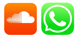
App categories often share similar iconography. Music notes or sound waves are present on 4 of the 5 most downloaded music/podcast apps. Social media-related apps often feature messaging bubbles. Especially in the early stages of your launch you may want to use these easily-recognized symbols to help users know what to expect when they use your product.
Keep colors high contrast

Phone users are going to have a variety of background imagery, which you cannot control. For this reason the vast majority of app logos feature either a white logo against a darker background, or the reverse. This is to make the icon visually pop no matter the color or pattern of the background screen.
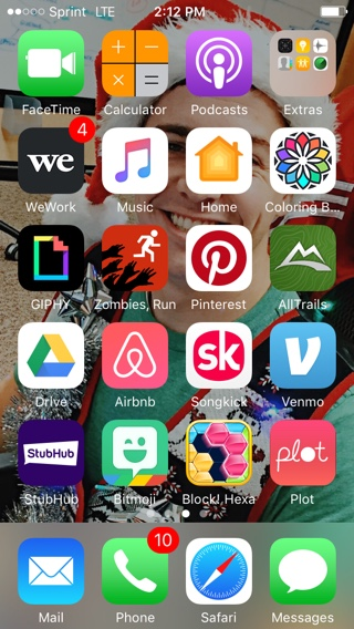
Even against this extremely colorful picture of our QA maestro, Eric, dressed up for Christmas
You can see in the above image how the bright white portions of the app icons “pop” best against a super busy background, while the red Zombies, Run icon is almost invisible at first glance.
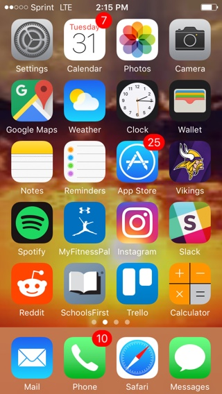
Sunsets are a super popular background image, but the orange of the sky totally hides the orange icons of Reddit and the calculator.
Game apps will often use a colored border around their icon to off-set and control the business of their icon design.
Keep lines thick

Again, in the interest of making your app icon stand out against any potential background, you want to make sure the lines of your logo are a minimum of 5 pixels wide. This will ensure that even if their background image is a close color-match of your icon background that your logo will still be visible.
Don’t bother using your name, unless…
Both Apple and Android display the name of the app directly below the icon, so don’t waste valuable visual real estate putting your product’s name on the app, unless you fall into one of two categories.
Your name is a seamless part of the logo itself a la Drizzly or StubHub.

Or you’re going up against an established competitor. In the case of Lyft, which launched as an Uber competitor, and OfferUp, which launched as a challenger to Craigslist, their branding had to do some heavy lifting right out of the gate. If this is the case for your app you may want to use a name-based logo that will help jumpstart your brand equity.
Use shadows sparingly
Shadows and light gradients can be used to add more depth to elements within the icon. However, this is a hallmark of more established business logos. You’ll see it often used in the icons for Google’s suite of products, and for apps of large brands like the NFL or Walmart.
Don’t change it too much

We weren’t alone in our 2am panic when we thought we’d deleted Uber from our phone. You’re generally “allowed” only one or perhaps two major changes throughout the lifespan of your product, unless you go through a major, major pivot. So make sure your icon is something you at the very least can live with for 2-3 years.
Make your icon distinct
If you have a beautiful icon that you love, you will likely be tempted to use it in the UX of your product. However this will confuse users. Think of your icon as the front door. You might have a beautiful, high-drama front door on your home, but you wouldn’t use that door inside your home.
Instead, we recommend using design elements from your icon, like colors, gradients, shadows, or line thickness to help create a cohesive experience.
Follow the Rules
Apple has its own set of suggestions that reiterate many of the themes we’ve discussed here. They also have a full list of the specs and sizes you’ll need to provide when you submit to the App Store.
Written by
 Signal-Based Selling FTW with Creative Service Agencies
  Build vs. Buy: Third Party or Custom-Developed Software
